Every year, I help run an online speedrunning event called Licenseathon. It’s an event where speedrunners from across the internet get together to showcase their licensed game speedruns. We’ve been operating since 2019 and each year is better than the last. However, one element hasn’t updated in a while: The presentation. I’ve been meaning to redesign the layouts for a while now, so the past few weeks have been dedicated to creating a new visual identity for the event.
The existing layouts look fine, but they are a bit simple and I wanted to spice things up for this event. I decided to throw it back to the early 2000s with the vectorheart design style - all angles, hard edges, straight lines, and flat colours. It’s starkly minimalist in colour and form, but exceedingly maximalist in composition which I think is a fun contrast. I’ve always been a fan of the style so I did some digging for reference material. Huge thanks to the Y2K Aesthetic Institute and sister account Vectorheart for their cataloguing of reference material.
During my search, I discovered some broad trends:
1. Print media inspiration Link to heading
Some vectorheart pieces really lean into the deconstructed print layout look, using largely rectangular features along with things typically omitted from the printing process: Registration marks, colour grade test patterns, along with futuristic-looking wireframes and bounding boxes, etc. Borders and alignment marks tend to be implied by the organization of objects on the canvas.

I’m particularly fond of this piece by Laurent Doucet about… Oranges.

Source: https://twitter.com/vectorheart/status/1541572085876633601
2. Digital graffiti Link to heading
Some works are stylized with angles and shapes meant to suit the aesthetic needs of that individual work, and often play with perspective using a limited palette and amorphous shapes. Chunks of readable text in these images tend to be plastered over big rectangles that break up the image, almost like a rendering error.

Source: https://twitter.com/vectorheart/status/1516944807356100608
Some works like this one make use of gradients, which is somewhat evocative of the earlier MetalHeart style. It definitely became more popular as time went on too.
Source: https://twitter.com/vectorheart/status/1287944806635909121
3. Vectorheart shapes as frames Link to heading
Some works use vectorheart techniques as a physical tool to frame a subject or surround it with information. This is the technique I like most, and I think it’s the most conducive to presenting information that’s actually meant to be absorbed, if using this style.

I particularly like this modern take from brawlersworld - Source: https://brawlersworld.com/aoi
Wipeout for the Playstation is my largest influence here. I love the way the art for these games communicates motion with just a few lines. The techniques at play are pretty simple too. The background looks complex, but it’s actually just text shredded with erase at various thicknesses. There are also a number of elements which hearken back to radio and walkman iconography - which makes sense, seeing as one of Wipeout’s selling points was the killer soundtrack. A number of words contain timekeeping symbols like ' and ", or countdown numbers, perfect for a racing game. It’s a smart design, and fits all three of the above themes I picked out earlier.

Making the layouts Link to heading
Taking the above sources as inspiration, I started to learn how to work with my tools by recreating some shapes from the reference material. This helped me break down the images into their constituent parts and better understand their construction. Once I felt like I had a handle on how to recreate the style, I created some glyphs:
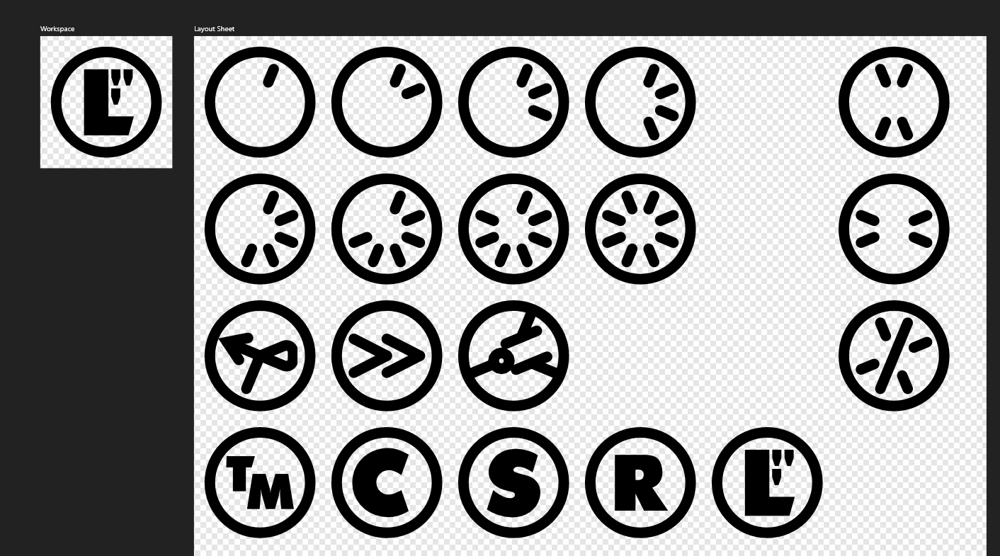
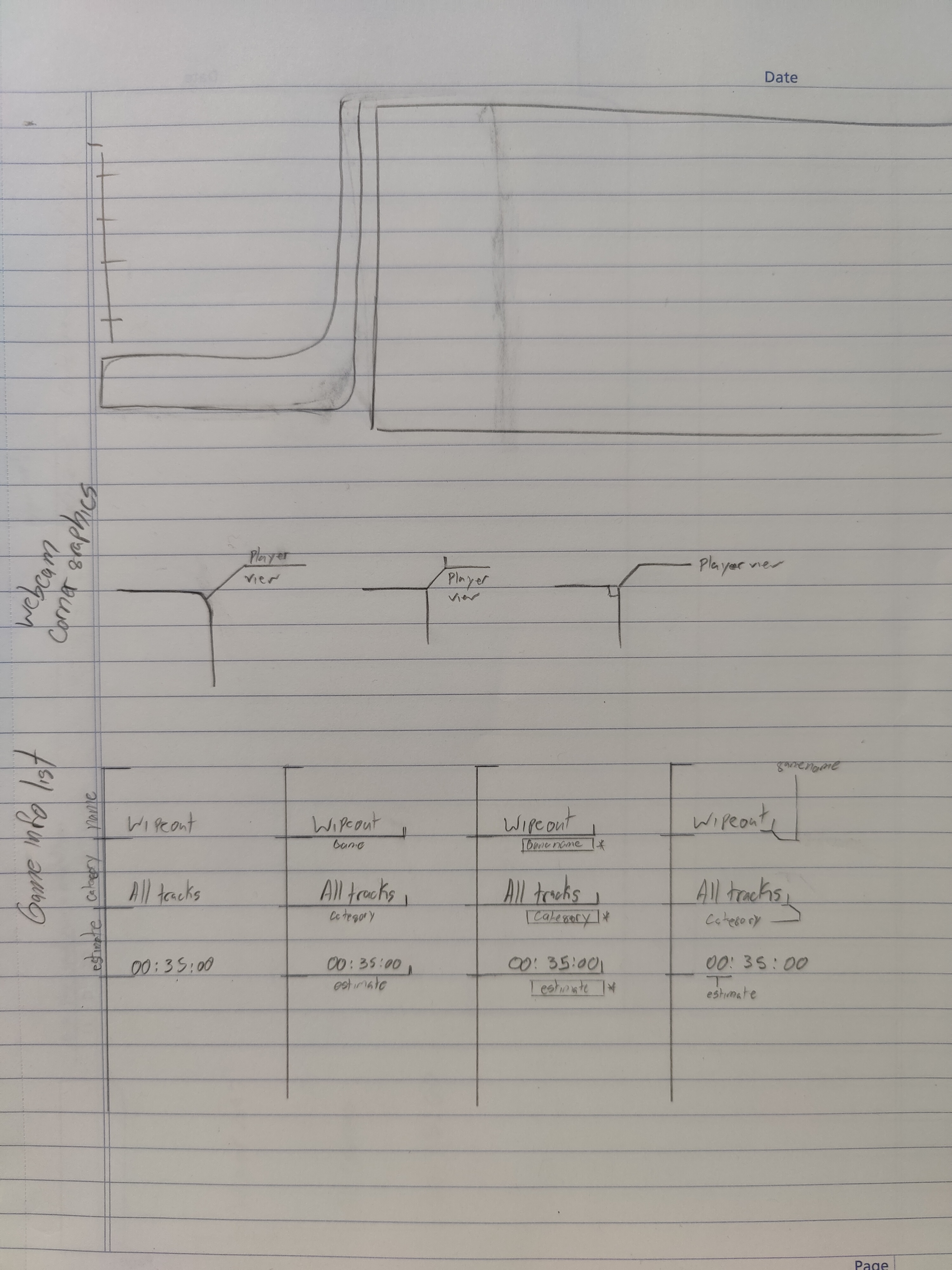
In Wipeout, there were various glyphs woven into the background. These were actually in-game icons for powerups and tracks, so it made sense to make some iconography for our layouts. Then, I made some sketches of the layout I wanted, as well as some ideas for how to construct various panels.
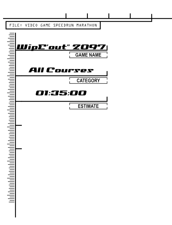
This concept sketch eventually came together in the form of a panel for holding info about an individual run:
As I worked, I did find that I was running out of ideas for glyphs and graphics, so I purchased an asset pack off Etsy to help me compose my layouts more rapidly. That was a big help! I even ended up composing an advertisement for the event entirely using the asset pack, and I was pretty happy with how that turned out. For now, this is what I’ve got, although I don’t think it’s quite complete yet.
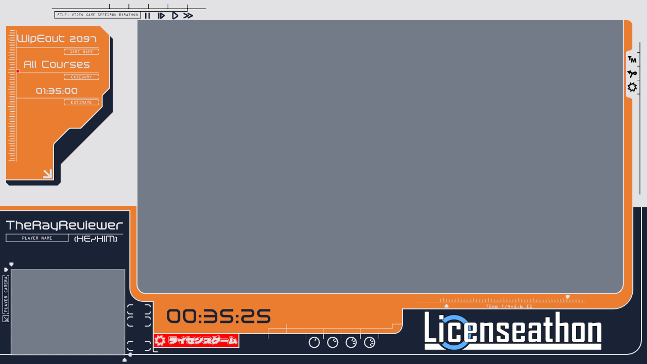
I think this captures the essence of the style, at least. There’s something not quite cohesive about it just yet but I’m sure I’ll get there in time. I think the mix of angled corners and rounded corners might not work as well as I thought, and I’m not certain I’m making good use of my space. There are places where complexity is good and places where it’s bad, and I haven’t quite nailed down where those boundaries lie just yet. Still, I’ll figure it out!
If you want to check out Licenseathon, check out the website at www.licenseathon.live, where you can find links to our Discord server, Youtube archive, and eventually signups for this year’s event.